The right animation can serve many purposes for a website. It can draw the eyes of customers to the content that matters, create a more dynamic sense of brand identity, and lend an air of professionalism to a site. But the opposite can also be true. Poorly implemented animation can be a distraction and make the overall look of your site shoddy. Animation in web design is not omnipresent, and a strong understanding of web design strategy in regards to animation is one of the things separating a top-tier website design professional from a hobbyist. Here are some of the web design essential tips you need to know about.
Menu Navigation
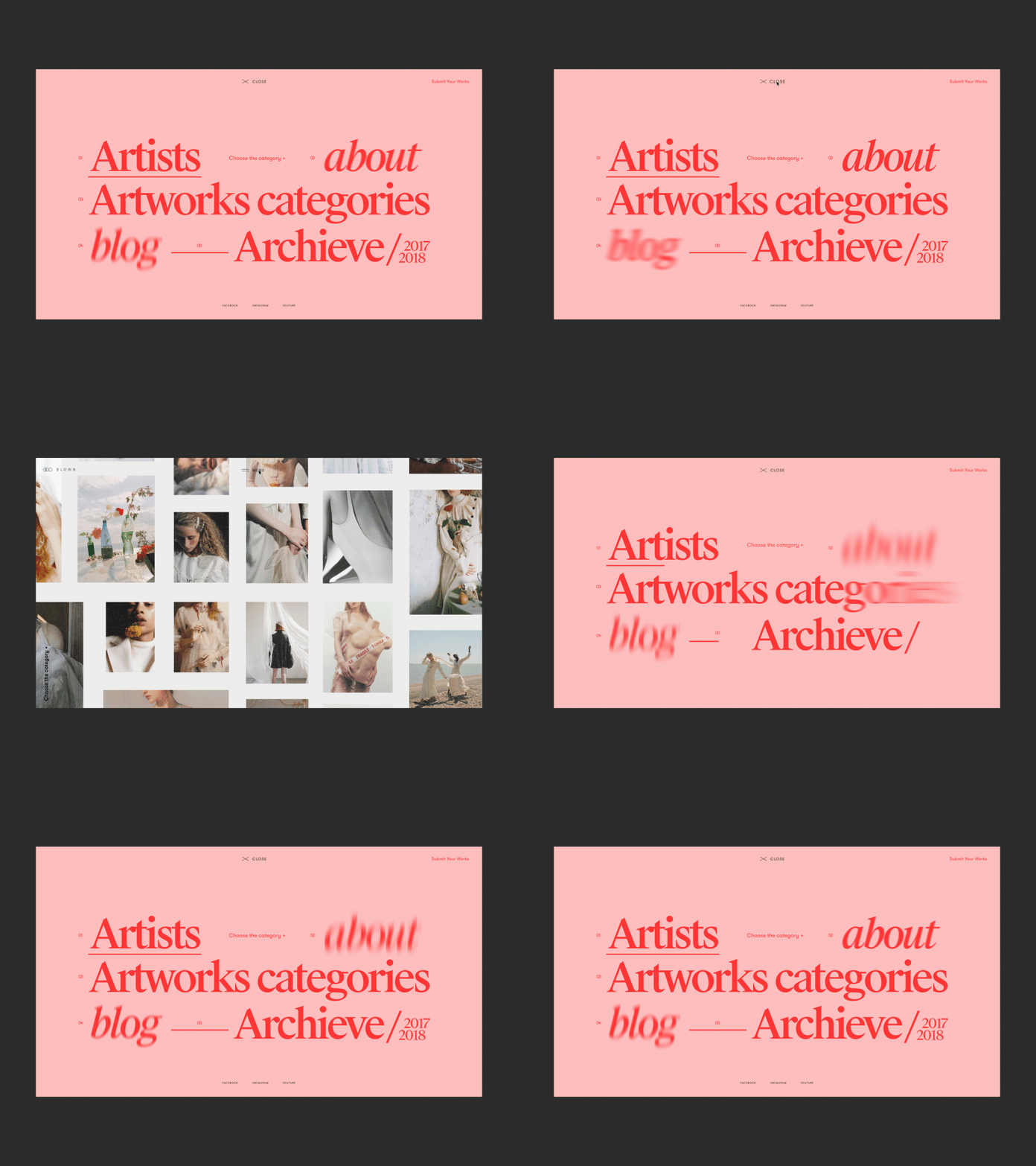
Animation guidelines for UX emphasize that animations, like all other elements of a site, should follow natural laws. In other words, navigating a site should be as intuitive as possible. The elements a user wants to access should be neatly accessible without cluttering the site. That’s why animated menus have become one of the prevailing graphic design trends.
This can readily be seen in the majority of online retailers. The basic departments a retailer will cover will be neatly aligned in a static navigation bar. But animations allow these menus to be expanded and direct users to the information they need. The result is a page that offers the best of both worlds.
Avoid the clutter of listing all the sub-departments on a single page. Minimize the number of clicks that a user needs to reach the content that interests them.
That said, unfolding menus can be implemented in a wide variety of ways. Navigation bar menus have become the de facto standard in retail. But sidebar hamburger menus continue to be in vogue and will stay that way for some time to come. Any site with a variety of content can benefit from these animated menus. They deliver a sense of order and distill user interaction without them having to backtrack unnecessarily.
Animation for Loading
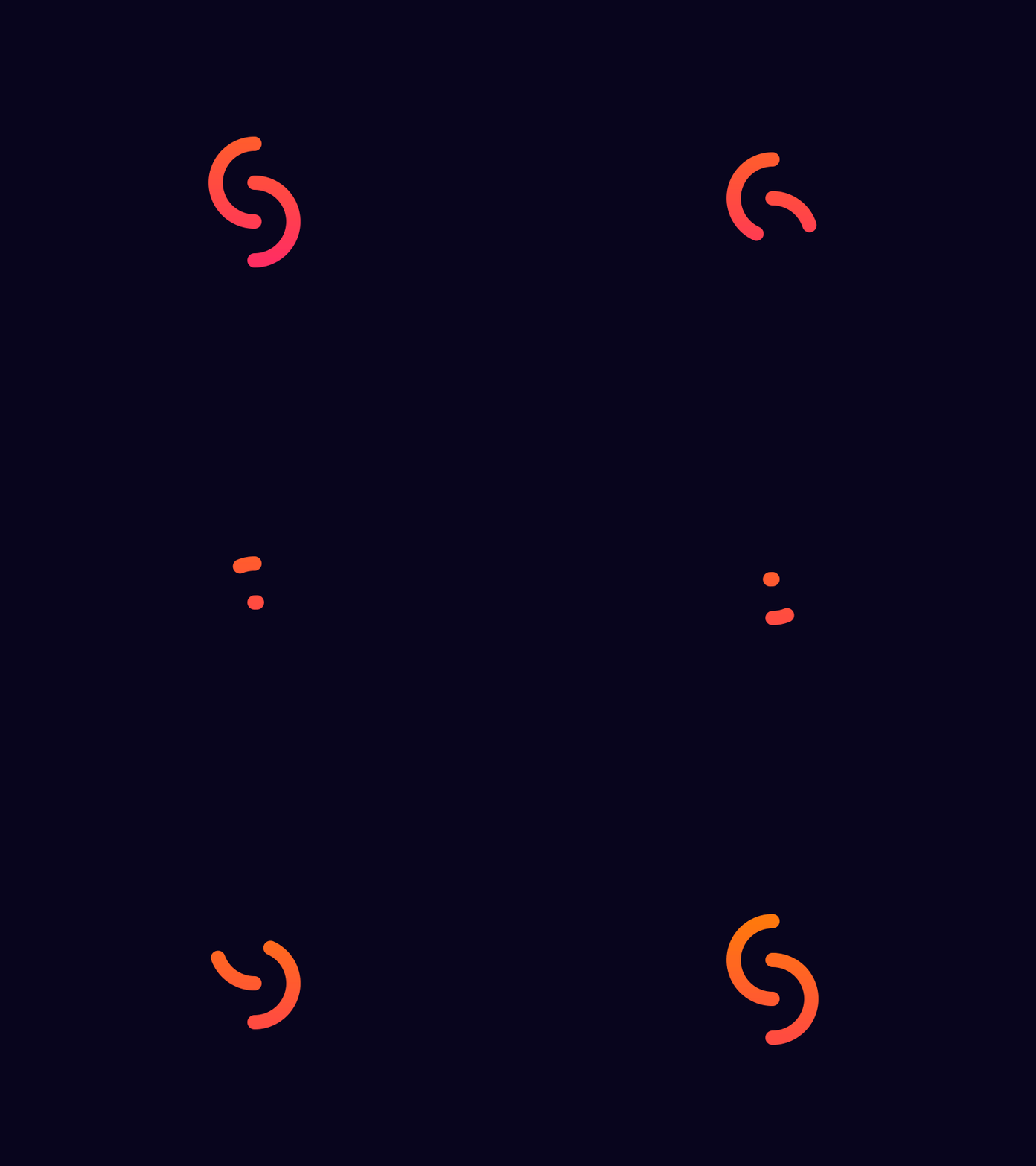
While a designer wants to make the UX as quick and seamless as possible, load times are sometimes an inevitability. In cases like these, the best alternative is to distract your users from the fact that they’re waiting. Loading animations are one of the oldest tricks, but they’re still effective, and their usage is becoming more clever and sophisticated with every passing year.
These animations are increasingly becoming an opportunity to tell a minor narrative with the time your users spend waiting, but it’s important to not think too big with these sorts of animations. The ultimate goal is to get the user to their content as quickly as possible, and the amount of time each user will spend on a loading screen will vary.
Minimalist and flat designs are the standard here, but there’s a lot of leverage to create a loading screen that reflects the culture and personality of your brand. You want to find a balance between animations that engage and overly elaborate animations that remind them they’re on a loading screen.
Hover Effects
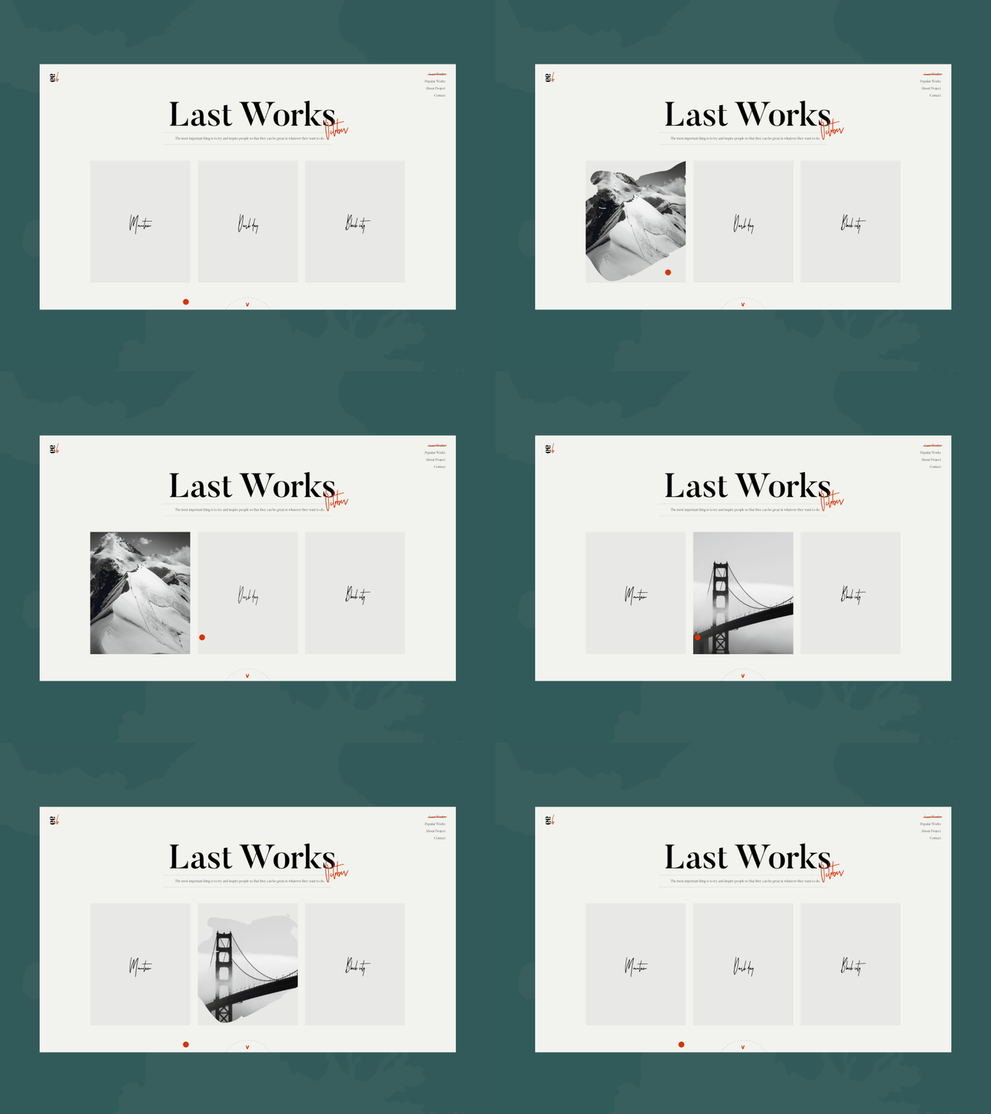
The increased dynamism available through JavaScript is leading toward website design trends that do more than just deliver information to users. Hover effects allow designers to create experiences that react meaningfully to the input of their users, and there’s a variety of animation techniques you can use here.
On a basic level, this could mean highlighting icons as users scroll over them, but more sophisticated hover effects allow you to bring components of an element into focus as a mouse approaches, or even to identify incorrect inputs in a web form like those you’d use for user logins or registration. The challenge here comes in the form of responsive design.
The CSS hover effect was born exclusively for personal computers, and developers often need to redesign these when adapting a site for mobile users. In more practical terms, a hover effect is one of the most intuitive ways to indicate to a user that an element can be interacted with.
Hover animations are one of the best functional animation effects you can incorporate into your site’s design. That’s because they can allow you to essentially double the real estate of an element. Take a clothing retailer as an example. A paneled catalog allows them to neatly lay out the items in each department. But by adding alternate photos or product information on hover, you minimize the need for users to keep clicking on images.
Photo Galleries
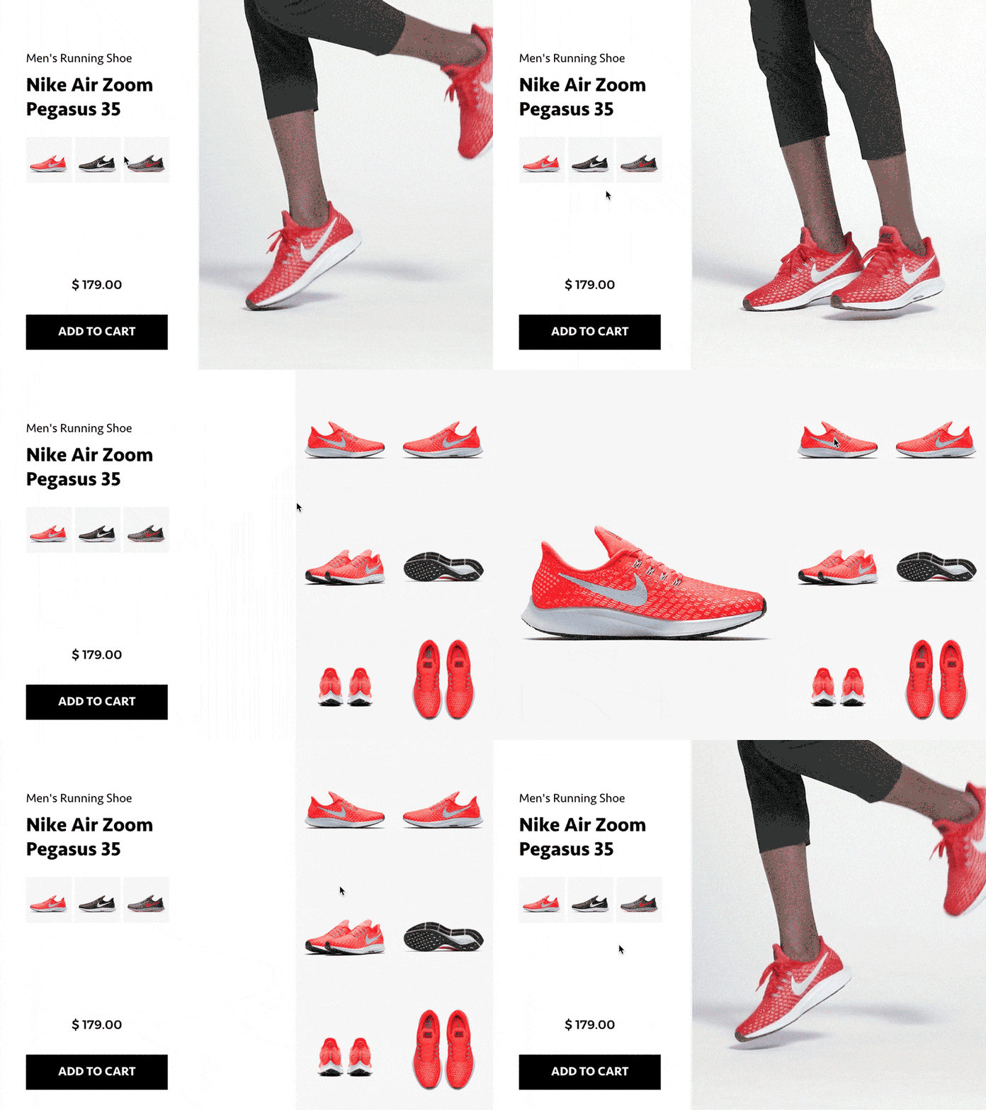
While hover effects can be a great way to convey a lot of information about a product or service in a limited space, photo galleries give you the means to tell an entire narrative. Web animation techniques can make this experience significantly more seamless. Slideshow and carousel effects are some of the more dominant design trends today. They allow you to put a huge number of images into your site without making the user scroll down.
CSS and JavaScript make the implementation of galleries, carousels, and slideshows a simple affair, so the difficulties here come down explicitly to design rather than development. Take into consideration whether you want the slideshow scrolling automatically, at the input of the user, or as a combination of both. If you’re using automatic scrolling, you’ll want to be careful about the speed at which your images cycle.
Animations that are too quick won’t give your users time to process the information, but too slow could bore them. Finding this balance is especially critical if you intend to incorporate text with your images.
Scrolling Animations
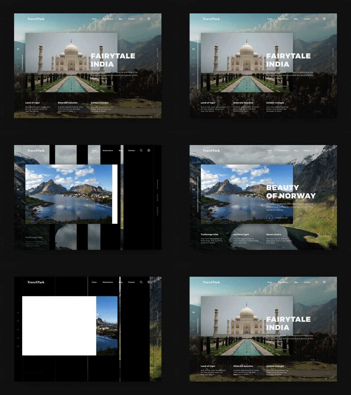
User experience philosophy generally suggests that you want to minimize the time that your users spend scrolling. Information that’s centered and concentrated leads toward an experience where users have everything they need as readily as possible. And while many sites are opting for single page designs that use intuitive and minimalist menus for navigation, an interesting new website trend is a transition toward scrolling sites that are essentially composed as blocks.
These sites tend to split their content up into screen-sized blocks that are compartmentalized from one another and snap into place on your screen when you scroll down. This is a great way for improving design because it allows you to create a curated experience for your user that always centers the design of your site on the screen.
And with frameworks like Bootstrap for CSS, you can create responsive scrolling designs that look good for every user without having to rebuild your experience for multiple different devices. But these scrolling designs rely critically on animation to get the job done. Without a smooth animation to signify the transition, the results can look sloppy and even be disorienting to users.


